A full dashboard redesign that lifted activation by 37%
We transformed a complex SaaS dashboard into a clearer, more actionable experience designed to help users reach their first meaningful outcome faster.
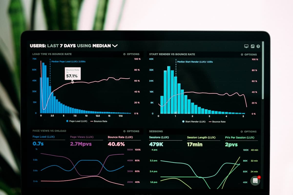
A capable product that new users couldn't find their way into
This concept represents a B2B SaaS platform teams use to track performance, manage workflows, monitor business activity, analyze data, collaborate and automate recurring tasks.
The product already had strong functionality. The problem wasn’t a lack of features — it was that users couldn’t easily understand where to start or what to do next. The dashboard had grown organically as features were added, and complexity crept in one shipped feature at a time.
The dashboard grew feature by feature — clarity didn't keep up
The product had plenty of value. The dashboard wasn’t making that value obvious.
Users weren’t failing because the product lacked features. They were failing because the path to value wasn’t clear enough.
Increase product activation
We define activation as a new user completing the key set of actions that indicates they’ve experienced the product’s core value — a definition specific to this product, not a generic signup-to-paid metric.
Reduce onboarding friction
Help users understand the product faster
Increase feature discoverability
Improve first-session completion
Reduce cognitive load
Improve dashboard usability
Create a scalable design system
Improve retention potential via early experience
A professional research process, not a hunch
User interviews
- Why users signed up
- What they expected
- Where they got stuck
- Which features they understood
- Which features they ignored
- What made them leave
Product analytics
- Signup → activation funnel
- Drop-off points
- Feature usage
- Session behavior
- First-session actions
- Dashboard interaction
Heatmaps / session analysis
- Dead zones
- Mis-clicks
- Navigation confusion
- Overlooked CTAs
- Repeated interactions
Competitor analysis
- Dashboard structure
- Navigation
- Onboarding
- Empty states
- Activation flows
- Information hierarchy
Users were overwhelmed by too much information before understanding the core workflow.
The primary CTA competed with too many secondary actions.
New users saw analytics before completing the actions required to generate meaningful analytics.
Empty states were treated as empty screens rather than opportunities for guidance.
The onboarding flow and dashboard experience felt like two separate products.
Users needed contextual guidance — not more documentation.
The activation problem was fundamentally a clarity problem.
Four people the dashboard had to serve at once
New User
Goal: Understand the product and achieve the first meaningful result.
Pain: Doesn't know where to start.
Team Member
Goal: Complete daily workflows quickly.
Pain: Too much navigation and information.
Manager
Goal: Monitor performance and make decisions.
Pain: Important insights are difficult to find.
Admin
Goal: Configure the product and manage users.
Pain: Advanced settings are mixed with everyday workflows.
Closing the distance between signup and first value
Don’t show users everything. Show them what they need next.
The dashboard prioritizes current goal, next best action, progress, relevant information, then supporting features — turning it from an information display into an activation engine.
You’re 2 steps away from completing your workspace setup.
Continue Setup →Create your first workflow to start automating your process.
Create Workflow →Navigation prioritized by frequency, intent and role
Dashboard
- Overview
- Tasks
- Analytics
- Workflows
- Reports
- Team
- Integrations
- Settings
The navigation prioritizes frequency, user intent, business importance and user role over an alphabetical or feature-launch-order list — reducing cognitive load by only surfacing what a given user actually needs to reach next.
A four-layer hierarchy — one of the central concepts in this redesign
Orientation
“What is happening?”
- Product status
- Account status
- Progress
Action
“What should I do?”
- Next best action
- Pending tasks
- Recommended setup
Insight
“What should I know?”
- Key metrics
- Trends
- Alerts
- Insights
Exploration
“What else can I do?”
- Advanced features
- Reports
- Integrations
- Secondary actions
Testing structure before visual design
Every blank screen and every first session became a design surface
No data yet.
AfterYour dashboard will show performance insights once you complete your first workflow.
Create Your First Workflow →Guidance + education + activation — not a dead end.
“The dashboard knows what I need to do next.”
Marketing Manager
- Campaign performance
- Conversion
- Reports
- Recommendations
Operations Manager
- Workflows
- Tasks
- Automation
- Efficiency
Executive
- KPIs
- Trends
- Business insights
- Alerts
Personalization here means reducing irrelevant information, not adding more of it.
Consistency across the entire product
Typography, color, grid, spacing, buttons, forms, navigation, cards, tables, charts, filters, tabs, modals, notifications, tooltips, empty/loading/error states — with a clear hierarchy for Primary, Secondary and Tertiary actions.
The ten screens that carry the redesign
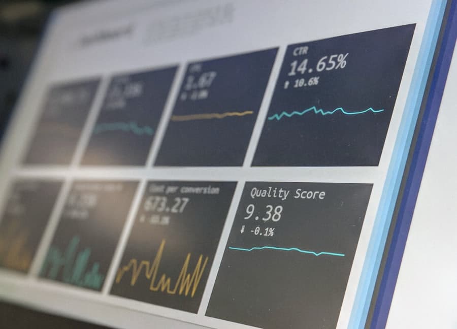
New Dashboard
Clear overview with next best action.
UX: Answers what's happening and what to do next in one glance.
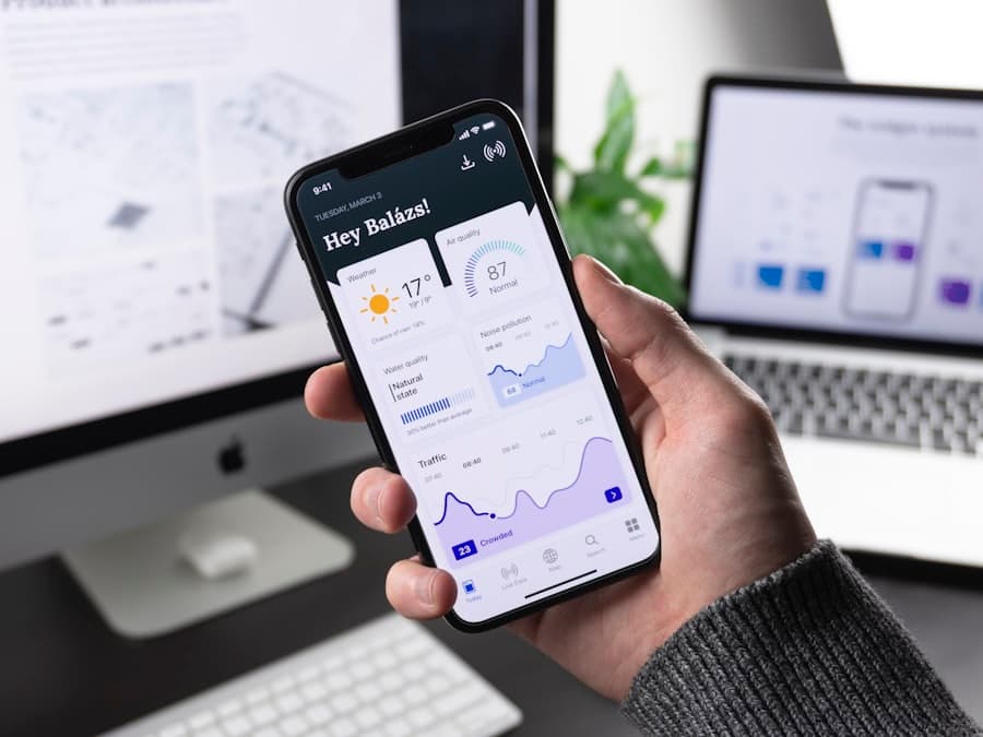
Personalized Onboarding
Goal-based onboarding.
UX: Connects directly to the dashboard the user lands on.

Progress / Activation
Shows how close the user is to the first value milestone.
UX: Makes progress toward value visible, not implicit.

Analytics Dashboard
Simplified, contextual metrics.
UX: Data shown with the context needed to act on it.

Workflow Builder
Create and manage workflows.
UX: Core value-creating action, front and center.

Task Management
Clear prioritized actions.
UX: One ranked list instead of a feature-first menu.
Empty State
Helpful guidance instead of dead-end screens.
UX: Every empty state points to the next action.
Insights
Actionable business insights.
UX: Insight framed as a decision, not just a chart.
Team / Collaboration
Team activity and management.
UX: Shared context without cluttering solo workflows.
Settings / Integrations
Advanced configuration separated from daily workflows.
UX: Kept out of the way until a user actually needs it.
From information center to activation engine
| Before | After |
|---|---|
| Information-heavy dashboard | Action-oriented dashboard |
| Too many CTAs | Clear CTA hierarchy |
| Generic dashboard | Personalized dashboard |
| Confusing onboarding | Goal-based onboarding |
| Dead-end empty states | Guided empty states |
| Feature-first navigation | Intent-based navigation |
| Data without context | Contextual insights |
| Users explore to learn | Product guides users |
| Signup → Dashboard | Signup → Guided activation |
Reducing friction at every stage
Primary result
+37% activation
Activation is defined per-product here: the key set of actions that show a new user has experienced the product’s core value — not a generic signup metric.
Better Activation
More users experience the product's core value.
Faster Time-to-Value
Users understand the product sooner.
Better Feature Adoption
Users discover features in the right context.
Lower Cognitive Load
Users spend less effort figuring out what to do.
Future opportunities, not existing capabilities
Personalization
Role and goal-based dashboards.
Intelligent Recommendations
Suggest next best actions based on user behavior.
Predictive Insights
Surface potential issues before they become problems.
AI Product Copilot
Let users ask “What should I focus on today?”
Adaptive Dashboard
Dynamically prioritizes information by goal, behavior and context.
Understand → Diagnose → Prioritize → Simplify → Guide → Activate → Scale
Understand
Understand the business, product and users.
Diagnose
Identify friction across the user journey.
Prioritize
Determine what users actually need to see and do.
Simplify
Reduce unnecessary complexity.
Guide
Design clear next steps.
Activate
Move users toward meaningful product value.
Scale
Build a reusable design system and product foundation.
Why this matters to the people who'd actually run it
For SaaS Founders
Turn more signups into activated users.
For Product Teams
Make complex products easier to understand and use.
For B2B Businesses
Reduce friction across critical workflows.
For Growth Teams
Design UX around measurable activation goals.
For Existing SaaS Products
Transform an outdated dashboard into a modern experience.
Is Your Product Losing Users After Signup?
Pxzen helps SaaS and digital product teams turn complex interfaces into clearer, more intuitive experiences designed around activation, adoption and growth.